


Shot Charts and Chris Paul
Examining KD and CP3's midrange excellence + thoughts on the limitations shot charts.
We’re back with another Friday newsletter!
Today, we take a look at how the three-point revolution actually made the midrange jumper more efficient for players like Chris Paul, along with a note on shot charts and some other work to check out from around the basketball world.
More Hoop Vision and HV+ content will be coming out soon — stay tuned!
Chris Paul and the Midrange Jumper
It’s that time of year again…
No, not THAT time.
Now is the time when NBA superstars begin winning playoff games with clutch midrange shooting.
During this year’s playoffs, eight players have averaged more than 10 points per game on pull-up jumpers. Of those eight, Chris Paul and Kevin Durant are the only two currently shooting over 50% on those jumpers.
The discourse around shot selection — whether on shows like Inside the NBA or simply on your Twitter feed — tends to be unbearable. And somehow, in a basketball world where the Warriors have three rings and Villanova has two banners, we are still debating whether three-point shooting teams can win championships.
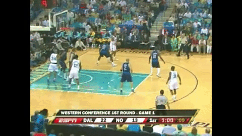
So before we go any further, it’s important to take a step back and realize how far we’ve come. The screenshot below is from Chris Paul’s first ever playoff game back in 2008. David West is the Pelicans player being trapped.

During the post trap, the weakside guards (#24 Bonzi Wells and #2 Jannero Pargo) are in “no-man’s land,” seemingly spotting up for the worst shot in basketball.
And that’s exactly the result of this play. West makes the skip pass to Pargo. Pargo makes the extra pass to Wells. Wells takes a long two instead of getting behind the three-point line.
If Wells backed up to the three-point line, it obviously gives him a chance at an extra point, but it also forces the defense to cover more distance. Jason Terry probably wouldn’t be able to get a meaningful contest if Wells in positioned how he would be in 2021.
But the impact of optimal spacing goes even further than that.
The initial post-up defensive coverage — where the Mavs trapped David West — doesn’t have nearly as severe consequences as it would in the modern NBA. In 2021, the Mavs likely don’t bring the trap at all — especially not before West even puts the ball on the floor.
Now we stumble upon the paradox of all this: The three-point revolution has made the midrange jumper more efficient than ever.
Here’s the spacing after Chris Paul snakes a ball screen from that same playoff game back in 2008.

And here’s the spacing now.

There’s never been a better time in basketball history — from a spacing standpoint — to be a superstar offensive creator with a lethal midrange game. Role players are relegated to the “threes and rim” philosophy, so the star has maximum freedom.
Shot charts are not that useful
Shot charts are pretty to look at. They’re also easy to understand and quite accessible, whether you’re a professional coach or a casual fan. Personally, though, I rarely find value in looking at them.
In a quick two-minute voiceover video, I explained why shot charts lack value.


To be clear, I think data can be an important part of determining optimal shot selection. We’ve written entire newsletters on that topic.
With shot charts, the problem doesn’t stem from an overarching flaw in analytics, but rather the nature of how it’s presented: shot charts reduce an entire possession down to one single location on the floor.
For analysis and decision making, I’m more interested in how the offense generated a given shot within that possession. The “how” is often more important than the shot itself.
In an HV+ tutorial from last summer, I walked through our “Offensive Accounting” report from my time at New Mexico State. The tutorial includes different examples of quantifying an offense without relying only shot locations.
By doing our own customized charting, we generated data that was directly applicable to our coaching staff’s decision making process. That helped us to answers questions beyond just “where should we shoot the ball from?” — and more into the how.
Links from around the internet
Want to go deeper? Check out a few things we’ve been reading and watching at Hoop Vision HQ:
Gibson Pyper on the Spain pick and roll plays by the Suns
What Data Can’t Do by Hannah Fry in The New Yorker
I was a guest on the Bump the Cutter podcast discussing a variety of college basketball related topics
Duke ball pressure and denials from the 2001 national championship game
Jim Calhoun 4-high series and zoom action
For Hoop Vision PLUS subscribers, I released 30-minute video of behind the scenes clips from the making of the Flex Offense video.
If you’d like to receive access to exclusive content and support Hoop Vision, please consider subscribing to Hoop Vision PLUS. For $10/month or $100/year, your subscription unlocks access to exclusive offseason content and helps Hoop Vision stay independent and ad-free.
Zoom action is used in the flex offense right ?